
The Strange Silence After the Click
In South Africa’s automotive marketing landscape, there is a familiar frustration that keeps surfacing inside dealership boardrooms and agency Slack channels alike.
The ads are working.
Clicks are coming in.
Google Ads dashboards glow with healthy CTRs. Meta campaigns show strong engagement. Marketplace listings get steady traffic spikes.
And yet, the inbox stays quiet.
No enquiries. No test drive requests. No finance applications. Just… silence.
This is where the illusion begins. Traffic is often mistaken for success, as though attention alone is the finish line. But attention is only the first handshake in a conversation that never happens if the rest of the experience collapses.
Clicks are not leads. They are just visitors standing at the door, deciding whether to enter or quietly leave.
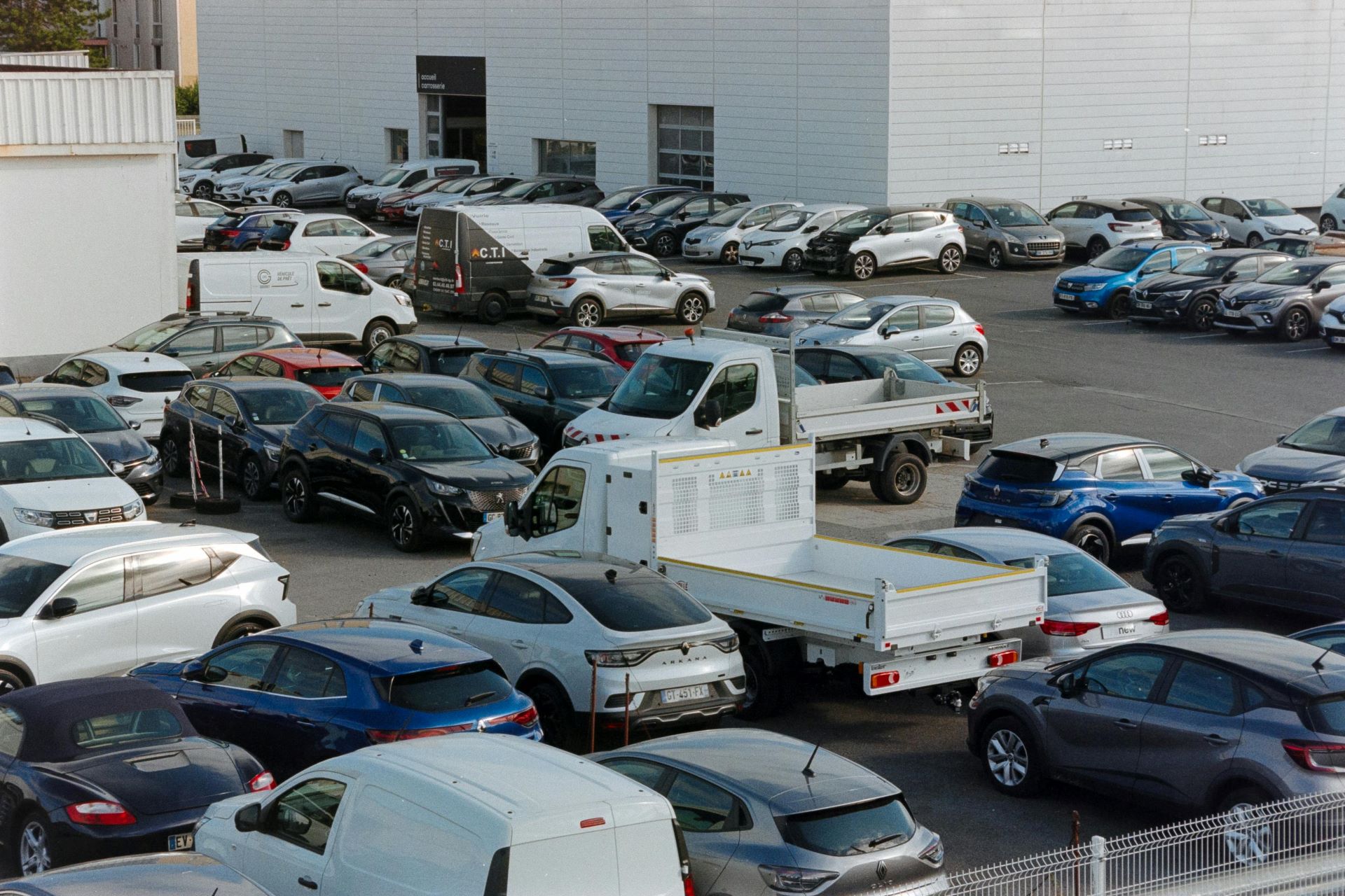
The Traffic Trap in South African Dealership Marketing
South African automotive buyers behave in a uniquely hybrid way. They research heavily, compare aggressively, and often switch between platforms before ever committing to a dealership enquiry.
A typical journey might look like this:
A user sees a Facebook ad for a pre-owned Toyota Hilux in Johannesburg. They click. They land on a page that looks slightly different from the ad. The price is unclear. The form asks for too much information. The page loads slowly on mobile data. They hesitate. Then they leave.
Later, they search again. Different dealership. Different ad. Same pattern repeats.
This creates what can only be described as a traffic illusion loop. Marketing teams see activity, but the funnel quietly leaks at every friction point.
The core issue is not reach. It is conversion architecture.
UX: The Invisible Salesperson in the Room
User experience, or UX, is often treated as a design concern. Fonts, colours, button shapes, layout spacing.
In reality, UX is your best salesperson. The one working 24/7 without commission complaints, handling every enquiry before a human ever gets involved.
When UX is weak, even the most expensive media spend becomes diluted. The dealership is effectively paying for foot traffic into a showroom with no signage, no greeter, and no clear path to the sales desk.
In South Africa’s competitive automotive market, where platforms like AutoTrader, Cars.co.za, and dealership websites all compete for attention, UX becomes the deciding factor between a scroll and a submission.
A strong UX does not persuade. It removes doubt.
The Landing Page Disconnect Problem
One of the most common conversion killers in dealership campaigns is the disconnect between the ad and the landing page.
The ad promises one thing. The page delivers another.
A user clicks on a Volkswagen Polo advertised at a specific monthly instalment. They land on a general inventory page with multiple vehicles, inconsistent pricing formats, and no immediate confirmation of the offer they saw.
At that moment, trust fractures.
In automotive marketing, trust is not built through branding alone. It is built through continuity. The message must feel like a single thread, not a stitched patchwork of campaigns.
When continuity breaks, users assume one of two things: either the deal is misleading, or the process will be complicated.
Either assumption kills the lead.
Mobile First or Mobile Forgotten
In South Africa, mobile traffic dominates dealership advertising. Many users are browsing on mid-range Android devices, often on limited data bundles, sometimes with unstable connectivity.
Yet many dealership sites still behave as though desktop browsing is the default reality.
Heavy image sliders, auto-playing videos, and multi-step forms designed for large screens create invisible resistance.
The irony is that most marketing budgets are already optimised for mobile ads, but the post-click experience is still trapped in desktop thinking.
A mobile-first UX is not just responsive design. It is ruthless prioritisation.
It asks a simple question: what is the fastest path from interest to enquiry?
Everything else is noise.
Form Friction: The Silent Conversion Killer
If UX is the salesperson, then the enquiry form is the closing conversation.
And this is where many dealership funnels collapse.
Forms are often overloaded with unnecessary fields. Users are asked for full addresses, ID numbers, employment details, and extended notes before they have even expressed basic intent.
In behavioural terms, this creates cognitive load. The brain begins to reassess effort versus reward.
A simple rule applies in automotive lead generation:
The higher the friction, the lower the intent required to abandon.
Even high-interest buyers will drop off if the form feels like a finance application instead of a simple enquiry.
The ideal dealership form behaves like a conversation starter, not a bureaucratic checkpoint.
Why South African Buyers Are Especially Sensitive to Friction
South African consumers are highly price-aware and trust-sensitive, particularly in automotive purchases where financing, insurance, and long-term commitment intersect.
This creates a unique behavioural pattern:
Users want reassurance before commitment, but most forms demand commitment before reassurance.
This mismatch creates hesitation.
If a user cannot immediately see clarity around price, availability, or next steps, they interpret the process as risky.
Risk perception is the silent conversion assassin in automotive marketing.
And it rarely shows up in analytics reports.
The Psychology of Abandonment
When a user clicks an ad, they are in a micro-moment of curiosity. That curiosity is fragile. It can be strengthened or destroyed within seconds.
Three psychological triggers commonly determine whether a form is completed or abandoned:
Uncertainty about cost transparency
Perceived effort of completion
Fear of unwanted follow-up or spam behaviour
Dealership UX often unintentionally amplifies all three.
Long forms feel like commitment. Poorly structured pages feel like uncertainty. Generic call-to-actions feel like spam pipelines.
Users respond by exiting quietly rather than engaging.
This is not rejection of the product. It is rejection of the experience.
The Role of Speed in Conversion
Page speed is often discussed as a technical SEO factor, but in dealership marketing it behaves more like emotional pacing.
A slow page creates doubt before content is even processed. On mobile networks, especially in mixed coverage areas across South Africa, this effect becomes more pronounced.
Every extra second of load time introduces friction that compounds across the funnel.
Speed is not just performance. It is reassurance.
A fast page feels trustworthy. A slow page feels uncertain, even if the offer is strong.
Visual Hierarchy and Decision Flow
Many dealership landing pages fail not because they lack information, but because they present it without hierarchy.
Everything competes for attention at once:
Vehicle images
Pricing blocks
Finance calculators
Navigation menus
Multiple CTAs
The user is left scanning instead of deciding.
A strong conversion-focused UX behaves differently. It guides the eye in a deliberate sequence: confirmation, value, reassurance, action.
In practice, this means reducing visual competition and prioritising clarity over density.
A visitor should never have to search for the next step.
The Hidden Cost of Over-Optimisation
There is a lesser-known problem in dealership marketing: over-optimisation.
In an attempt to improve lead quality, some systems introduce more fields, more validation, more segmentation.
While this can improve CRM hygiene, it often reduces volume disproportionately.
The result is fewer leads, even if each lead is technically better qualified.
The balance between UX simplicity and lead quality is delicate. But in most South African dealership campaigns, the scale is still tipped too far toward friction.
Volume matters, because volume creates opportunity for conversion optimisation later in the funnel.
Trust Signals That Actually Work
Trust in automotive UX is not built through decoration. It is built through clarity and consistency.
Effective trust signals are often subtle:
Clear pricing consistency across ad and landing page
Visible stock availability
Transparent location and contact options
Realistic imagery instead of overly polished stock photos
Users are not looking for perfection. They are looking for authenticity.
If a page feels overly engineered, it can paradoxically reduce trust. People begin to suspect manipulation rather than information.
The Finance Funnel Blind Spot
In South Africa, vehicle finance is a major part of the purchasing journey. Yet many dealership forms treat finance as a secondary step instead of an integrated path.
When users cannot quickly understand affordability, they hesitate.
Simple finance clarity, even in approximate terms, dramatically improves engagement because it aligns with how users actually make decisions.
They are not just buying a car. They are buying a monthly reality.
When that reality is unclear, they disengage.
Why Most CRM Systems Don’t See the Real Problem
Dealership CRMs are excellent at tracking leads. They are less effective at diagnosing why those leads never formed in the first place.
A CRM sees submissions. It does not see hesitation.
It does not see the user who almost filled out the form but abandoned at field three. It does not see the confusion caused by mismatched messaging. It does not see the cognitive overload on mobile devices.
This creates a dangerous blind spot where optimisation focuses on downstream behaviour instead of upstream friction.
The real problem often lives before the form is ever completed.
UX as a Revenue Multiplier, Not a Design Layer
In high-performing automotive campaigns, UX is not treated as cosmetic. It is treated as infrastructure.
Every element either supports conversion or quietly subtracts from it.
When UX is improved, the effect is rarely linear. It is compounding.
Small reductions in friction can lead to disproportionately large increases in enquiry volume because they unlock users who were previously on the edge of abandonment.
This is why two dealerships with identical ad spend can produce dramatically different results.
They are not buying different traffic.
They are converting it differently.

The Final Reality: Clicks Are Only Potential Energy
Clicks represent interest. Nothing more.
They are compressed intent waiting to be released or lost.
In South African automotive marketing, where competition is intense and buyer attention is fragmented across platforms, the difference between a lead and a lost visitor is rarely the ad itself.
It is what happens after the click.
UX and form optimisation are not backend concerns. They are the core mechanism that determines whether marketing spend becomes pipeline or evaporation.
The dealerships that understand this shift stop asking why ads are not working.
They start asking what the experience is doing to the people who already arrived.
And that is where conversion begins.
Breyten Odendaal
Specializing in high-performance automotive advertising and digital marketing solutions, delivering cutting-edge insights and the latest news shaping the automotive industry in South Africa.
More From Advertising

Automotive Digital Ads in South Africa: A Shift
Exploring how South Africa’s automotive advertising evolved from print and broadcast to data-driven, programmatic digital ecosystems.

The Video Shift in Car Buying Decisions in SA
Explore how video content shapes car purchase decisions in South Africa, comparing short-form and long-form strategies for automotive marketers.

Why Automotive Ads Must Think Like E-Commerce
Automotive ads in South Africa need e-commerce style conversion thinking to boost leads, optimise funnels, and improve dealership ROI.